The Ink Black Heart – Crafting the Cover
Duncan Spilling, head of design at Little Brown, the Robert Galbraith publishers, answers some questions about creating the cover.
How many ideas were generated before a final direction came together for The Ink Black Heart?
There were 8 initial ideas to start discussions and then several variations based on a chosen route before we reached the final approved design.
There’s a strong contrast between the colourful leaves against the dark graveyard, is there a significance of the leaves in the story?
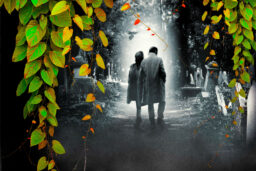
The leaves act on many levels. Picking up on the descriptions of entangled and overgrown gravestones as well as acting as a way to frame the scene and draw the viewer’s focus into the setting. It enabled us to move the cover approach on from previous books. Introducing more colour and depth to the design meant we didn’t have to completely re-imagine what had already been working so successfully.
Which Strike cover have you enjoyed designing the most, and why?
It’s possibly this latest one. When working with an established look it’s an exciting creative challenge to move a design on whilst retaining the core elements of what has been so recognisable.
What challenges have you faced when designing the covers, particularly when trying to present the relationship between Strike and Robin?
It has always been important to try to convey the right dynamics of the partnership between the characters, along with creating the right poses that echo the sense of mood of the story. This can be even more of a challenge when you’re several books into a series and need to keep the design feeling new and different.
There seems to be a brighter spotlight on Strike and Robin compared to other covers, does this have any further meaning?
There is no specific additional meaning for the lighting. The setting is much darker than some on the other covers, with a canopy of trees and ivy, so a stronger source of light was needed to highlight and draw the focus onto the main characters of the story.
How much do you look at the competition in crime fiction to help determine the creative direction of the cover?
Rather than being influenced by the competition in crime fiction we review it to ensure we can remain unique and look at ways to adapt and improve our own covers for our readers, even when you have an established, recognisable and successful approach.
How far out do you know what trends there will be in crime fiction covers?
With the nature of book publishing and the rapidly changing market, trends can come and go quickly. We can work up to 12 months ahead of publication but may, in some cases, readjust our thinking within that time frame to keep things relevant and fresh.
What would your advice be to anyone starting out in illustration and design?
Your portfolio of work is everything – if you are keen to get into a particular area of an industry and your current experience, course or portfolio of work hasn’t allowed for this, show initiative to demonstrate your desire by creating self-generated examples of how you would approach the design/illustration of existing material/publications.


