Troubled Blood – Designing the Cover
By Duncan Spilling, Head of Design, at Little Brown
What is the starting point in the cover design process for you?
The words come first — what do we want to say about the story, what are the key themes, what mood and atmosphere do we want to evoke? The combination of all these then helps to start build a picture.
How many ideas do you generate before a final direction comes together?
This can range from several diverse approaches to many variations on a similar theme. As with anything creative solutions can be found immediately or can go through several revisions to achieve the right result.
When it comes to designing for a series of books, what comes first — the series ‘look’, or an individual book design that you then apply to the others?
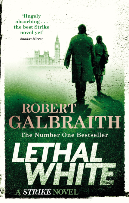
In the case of the Strike series the new look was initially created for Lethal White, focusing on the location and characters. The themes, branding and styling was then applied to the other three books. I always start with one title and as this develops ensure it looks unique but has a base design which can easily be adapted for other titles.
How have the Strike covers evolved over time? What have some of the challenges been?
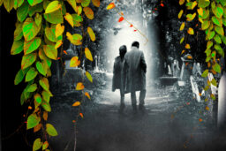
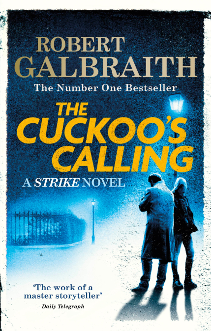
From the original covers, which only depicted the character of Strike within a London setting, I developed the design focusing on the representation of both Cormoran and Robin and their growing partnership, set against the backdrop of a London-based location. I also took the opportunity to simplify the design, reimagine and strengthen the title and author branding, which all helped to establish a more distinctive look within the market.
When working with two characters on a cover most of the challenges came from ensuring the right portrayal of the relationship between them, as on many occasions the figures where photographed separately.
From the original covers, which only depicted the character of Strike within a London setting, I developed the design focusing on the representation of both Cormoran and Robin and their growing partnership
The covers have a texture to them so they look gritty, or well-worn — what was your inspiration there?
Much of Strike’s working environment was pretty rough and ready. It was also inferred from the briefing that the covers should convey a gritty London feel, much like the title sequences of the TV series.
Did you see the TV series, and did knowing how Strike and Robin were portrayed to a huge TV audience impact how you approached the cover designs (for the non-TV tie-in editions)?
As with the TV series, the latest design needed to convey the story of the two main characters, Strike and Robin, and their partnership. This enabled me to create a design that differentiated itself from other crime book covers, where there is only focus on a lone figure. On many fiction covers, there is a tendency to hint at a character whilst obscuring actual representation, hence the semi-silhouetted approach on this series. The TV styling helped to influence Robin’s clothing options. However, Strike was always going to be depicted in his iconic long overcoat, something we had adopted from the original book covers before the TV series.
Lethal White had a complex, multi-layered plot — was it hard to choose a focal point for the cover design?
As I mentioned earlier the starting point is always to have a focus, in this instance the main character partnership and setting. And then to build mood and atmosphere around this. A cover never sets out to express every aspect of a storyline, but is a window to the story within.
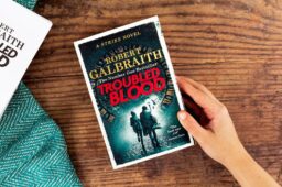
For Troubled Blood — how did you choose the clock as a focal point? [Without spoilers please]
The author’s input identified this as an ideal image to use. The shape and construction of a clock face also created an ideal framing device for the design to set the lettering within and draw the viewer into the scene. This also achieved something which was more emblematic rather than just location-based.
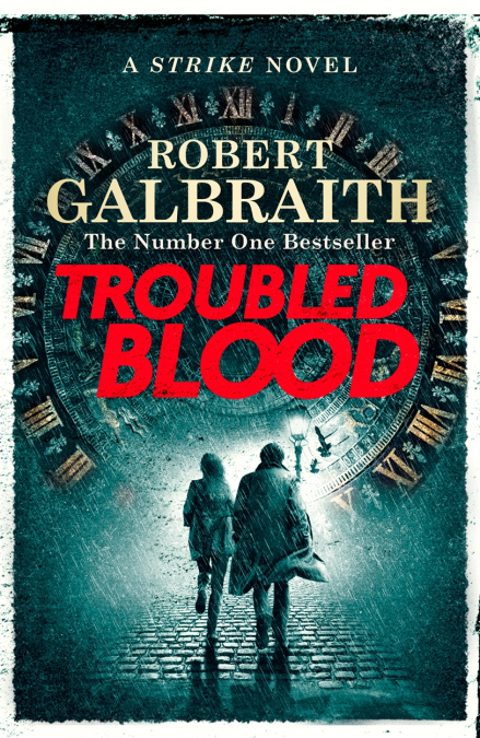
The figures on the cover portray the tension between Strike and Robin so well. On the latest book they are in motion for the first time, running — how did you decide they should appear this way on Troubled Blood?
Again, I wanted to ensure the latest cover was unique and individual as well as moving the look forward. The addition of running figures, rain and birds taking flight all helped to introduce more dynamism, drama, tension and an atmosphere of underlying menace.